.webp)
.webp)
Role
Product Designer (end-to-end)
TEAM
1 Product Designer
3 Developers
1 Project Manager
1 Founder & 3
Stakeholders
TOOLS
Figma
Maze Testing
AI Tools
Atlassian
Microsoft Clarity
aPP REACH
70,000+ Users
4,000+ New Monthly Users
42,000 App Sessions Per Month
JUMP TO:
OVERVIEW
This case study showcases the end-to-end process of the app's core features to address key pain points, enhance user satisfaction, and support business growth.
Leading the process
In this project, I led the entire design process from concept to execution. As the primary Product Designer, I took full ownership from competitor analysis to high-fidelity prototypes, delivering a scalable, user-friendly design. The mission was clear: Increase the platform's engagement while providing user and dealership-led goals.
About mymoto rewards
Mymoto Rewards is a loyalty and ownership-management app provided by 80+ car dealerships across Australia to 80,000+ customers, offering benefits and discounts. The vision was to create a single, intuitive app that added value to customers, increasing the overall engagement while also strengthening dealership loyalty.
Core features
- Discount marketplace with nationwide offers
- Purchase & manage discounted digital gift cards
- Multi-vehicle management for owned cars
- Book a service with participating dealerships
- Real-time car valuation
- Ability to sell a car to dealers directly through the app
problem
The existing mymoto rewards website suffered from extremely low engagement, with 98% of users becoming inactive shortly after signing up.
The platform wasn’t delivering value to customers and dealerships needed a more compelling tool to support vehicle sales and ongoing customer loyalty.
Solution
We transformed mymoto rewards into a mobile-first app that delivered real value before and after purchase. With personalised rewards, discounted gift cards, and easy vehicle management, the app drove ongoing user engagement while giving dealerships a compelling loyalty tool to strengthen relationships and support sales.
Deliverables
The new Mymoto Rewards app launched across 80+ dealerships and significantly improved engagement, replacing the earlier 98% inactivity rate. Dealerships gained a strong post-purchase loyalty tool, while features like discounted gift cards, rewards, service bookings, and valuations drove consistent user return. Positive feedback from customers and stakeholders validated the product direction and overall design approach.
4
Key User Flows
88
Screens
140+
Users Tested
Impact
Mymoto Rewards evolved from a low-engagement website into a high-value mobile app that reinforced customer loyalty and created new revenue opportunities for dealerships. Users gained ongoing benefits that kept them connected long after their purchase, while dealerships saw increased service bookings, valuation requests, and repeat interactions, turning the platform into a meaningful touchpoint throughout the entire ownership lifecycle.
project results
28%→74%
Monthly Active Users
42,000+
App Sessions per month
70,000+
Users reached
4,000+
New monthly members
68%
Reduction in onboarding user drop off
JUMP TO:
RESEARCH
I knew the engagement and activity rate was at an all time low for mymoto but to dive more into the problems and ideas, I interviewed reward base app users and facilitated stakeholder workshops.
/01
Stakeholder workshop
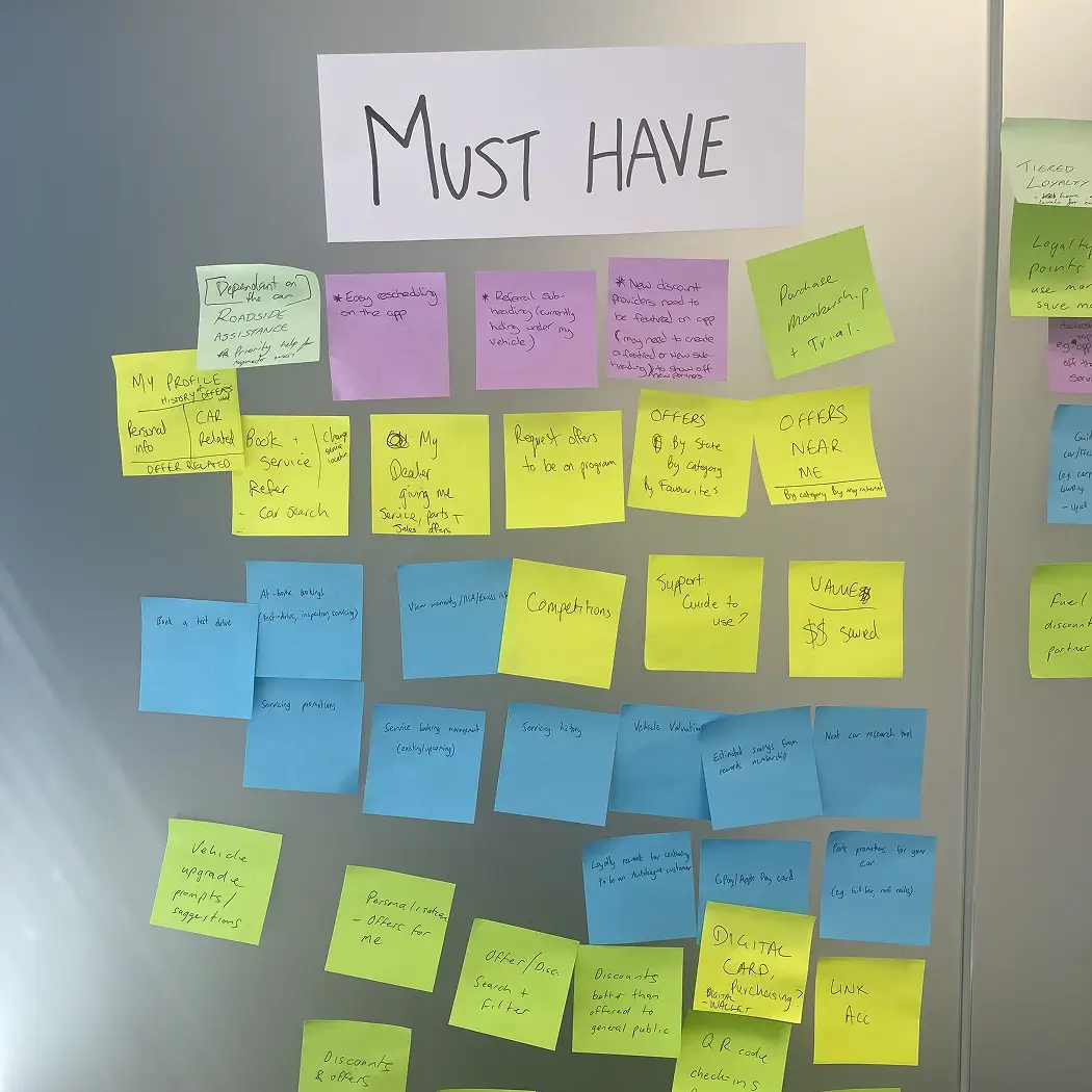
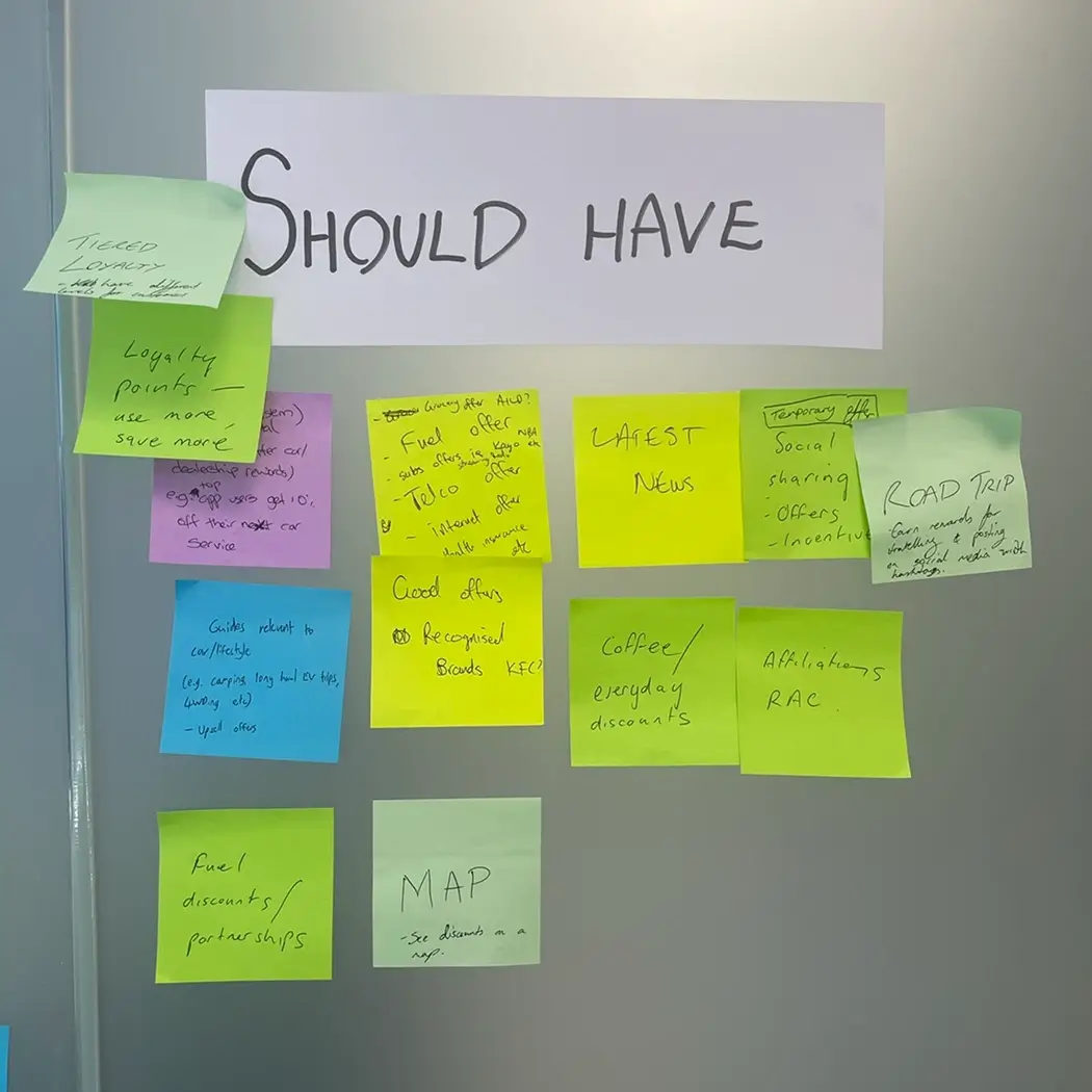
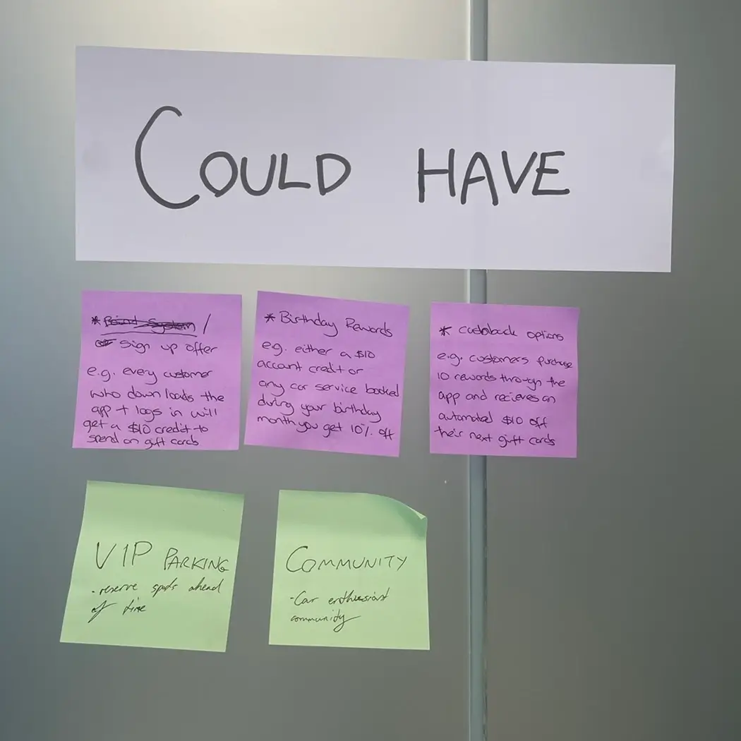
I facilitated several discovery workshops across dealership groups and internal business units, including:
- MoSCoW prioritisation sessions to align scope across 80+ dealerships
- Service blueprinting to map operational bottlenecks
- Value proposition exercises to clarify user and dealer incentives
Key insights:
- Dealerships wanted a retention tool but didn’t know what customers valued beyond service reminders.
- Gift cards and discounts were a strong incentive but needed to feel trustworthy and easy.
- Customers wanted transparent ownership management, especially around maintenance, costs, and resale value.
/02
Analysing mymoto rewards data
To understand why the original platform had a 98% inactivity rate, I conducted a full analysis of both qualitative and quantitative data. This included reviewing user behaviour analytics, dealership usage patterns, and customer support logs to pinpoint where engagement was dropping off.
Insights gained:
- Users didn’t understand the value of the membership early enough.
- The site wasn’t designed for mobile, despite most users accessing via phone.
- Rewards and gift cards weren’t surfaced prominently, reducing perceived value.
- The platform lacked features with long-term relevance, such as service reminders or car management, leading to zero ongoing utility.
- Dealerships needed stronger tools and clearer messaging to help users activate effectively.
%20(1).webp)
/03
User interviews
To gain deeper insights into users who use reward apps, I facilitated 30 minute interviews with 10 users. 5 users who have previously used mymoto rewards and 5 users who use woolies rewards, flybys, shopback and other discount reward based apps.
Insights gained:
- Users were highly motivated by discounts if presented in a clean, trustworthy format.
- Customers were heavily enticed by a point system, having them working towards a goal.
- Many car owners forget service dates or lose records.
- The “sell my car” process felt intimidating—users preferred dealer-handled solutions if frictionless.
%20(1).webp)
/04
COMPETITOR RESEARCH
I analysed leading loyalty, rewards, and vehicle-management apps to understand market expectations and identify gaps. This included discount platforms, automotive service apps, and dealership loyalty tools.
Key findings:
- Reward apps set strong standards for clear savings, simple gift card flows, and trust-building UI.
- Automotive apps offered basic service reminders but lacked integrated rewards or valuations.
- Dealership loyalty tools were fragmented, often limited to service booking without ongoing value.
Opportunities Identified:
- Combine rewards + vehicle management into one cohesive experience.
- Improve onboarding clarity, as competitors made value obvious from the first screen.
- Add high-value features competitors lacked, such as real-time valuations and family car management.
.webp)
/05
PERSONAS & USER JOURNEY
I defined three key personas; the Value Seeker, the Family Manager, and the Everyday driver to understand user motivations around savings, convenience, and vehicle management. Mapping the user journey highlighted major friction points, including unclear onboarding, low visibility of rewards, and limited long-term value. This informed a redesigned flow that clearly communicated benefits, simplified vehicle setup, and introduced features like valuations, service reminders, and gift card management to drive ongoing engagement. A point system was also created to see how engaging this would be to users.
.webp)
/06
Project Documents to low-fi
I translated the project requirements that was gathered from stakeholder workshops, dealership needs, and user research into clear user flows and low-fidelity wireframes. Throughout this stage, I documented detailed notes around decisions, assumptions, and dependencies, ensuring everything was clearly laid out and easy for me and the team to understand. This allowed us to validate priorities early, explore layout options quickly, and establish the app’s overall structure before moving into high-fidelity design.
.webp)
ideation
I knew the engagement and activity rate was at an all time low for mymoto but to dive more into the problems and ideas, I interviewed reward base app users and facilitated stakeholder workshops.
/07
Inspiration
During ideation, I explored a wide range of reward, finance, and automotive apps to gather inspiration for design patterns, visual styles, and interaction behaviours. This helped identify best-in-class approaches to navigation, card layouts, savings presentation, and vehicle management. By analysing what worked well across these apps, I pulled forward the most intuitive and user-friendly elements to inform the initial concepts and set a strong foundation for the overall design direction.
.webp)
/08
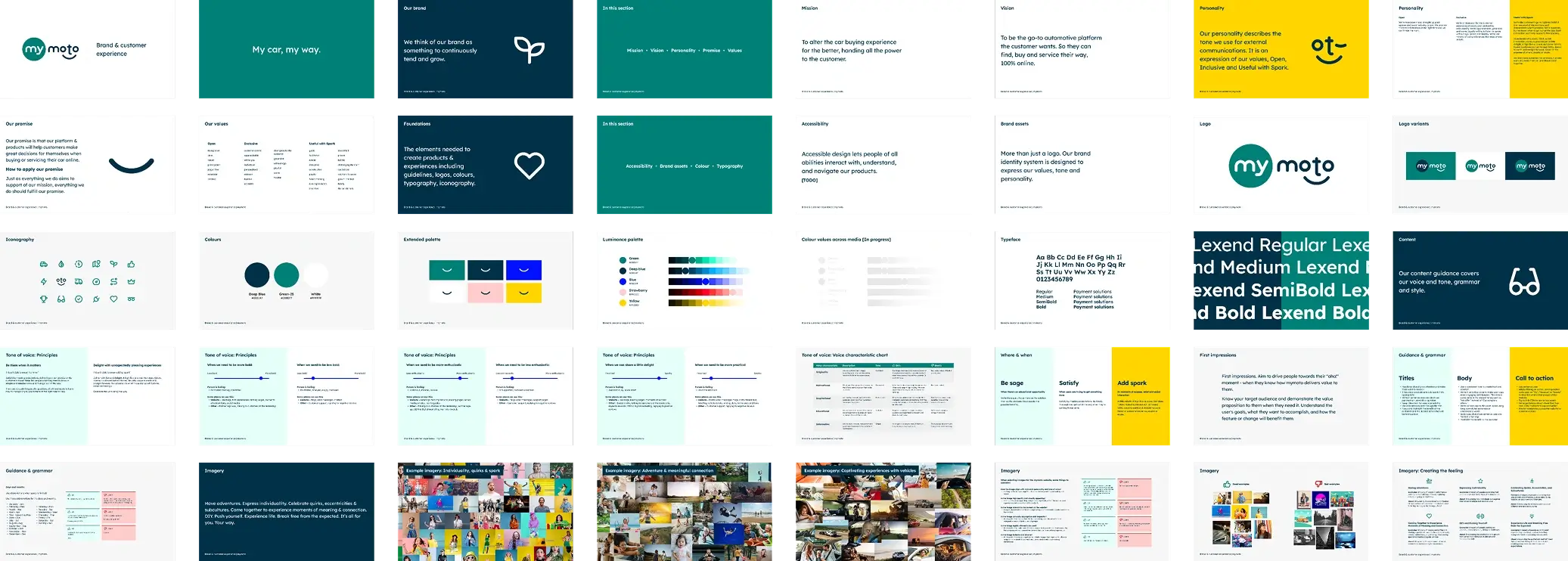
Utilising a brand guide to define a tone of voice
Utilising the brand guide I previously helped create, I defined a clear tone of voice and visual style for the product. This allowed me to maintain consistency across colours, typography, spacing, and component design while ensuring the app felt trustworthy, helpful, and easy to understand. The established tone reinforced clarity around rewards, savings, and vehicle information, creating a cohesive experience across all touchpoints.
/09
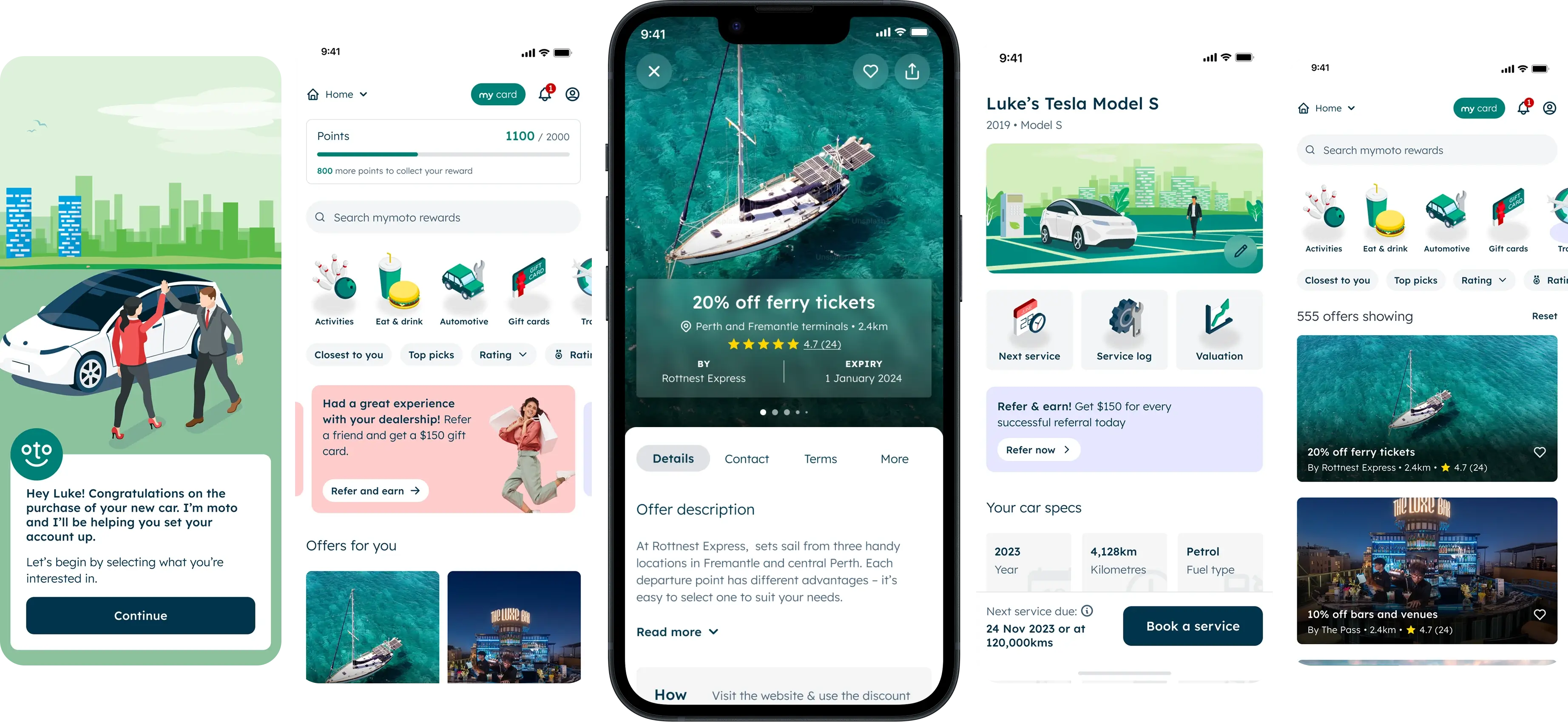
High-fidelity wireframes
I evolved the low-fidelity concepts into high-fidelity wireframes, refining layout, hierarchy, and interactions while still keeping visuals neutral and not fully styled. These high-fis were then turned into an interactive prototype to showcase key flows, such as rewards, gift cards, valuations, and vehicle management. This allowed for clearer usability testing, more informed stakeholder feedback, and smoother alignment with developers before moving into final UI design.
.webp)
DESIGN
/10
Design System
I built a scalable design system using Radix themes, enabling consistent components across the product and supporting both light and dark modes. The system established clear foundations for spacing, typography, colour tokens, and interactive states, making it easy for developers to implement and maintain. This approach ensured visual consistency, improved accessibility, and allowed future features to be added with minimal design overhead, while remaining fully aligned with the brand guide.
.webp)
/11
UI Design and prototyping
I refined the high-fidelity wireframes into fully realised UI designs, applying the design system, brand elements, and final visual styling. From there, I created interactive prototypes that demonstrated complete user flows and micro-interactions, allowing stakeholders to experience the product as intended. These prototypes supported usability testing, guided development handover notes, and ensured a clear, consistent understanding of the final design across the entire team.
.webp)
/12
User Testing
Using Maze, I ran large-scale quantitative tests on key user flows to validate usability and identify friction points early. This included tasks such as onboarding, exploring rewards, purchasing gift cards, and setting up a vehicle. The insights from heatmaps, drop-off points, and task success rates guided several UX refinements, helping ensure the final product was intuitive and aligned with real user behaviour.
140+
User Testers
94%
Test Completion Rate
‘Clean’ ‘Easy to use’
Main Emotional Response
Impact
Smarter UX leads to stronger outcomes
This project was about solving dealership issues and user problems through smart strategy and focused execution.
- I started with strategy, not screens
- I prioritised business goals and users needs
- I designed a scalable system, not just static mockups
- I delivered smart solutions that breached expectations (not just what was asked, but what was needed)
project results
28%→74%
Monthly Active Users
42,000+
App Sessions per month
70,000+
Users reached
4,000+
New monthly members
68%
Reduction in onboarding user drop off
.webp)
.webp)
.webp)